Saturday 27 March 2010

Evaluation- Question 4

How did you use media technologies in the construction and research, planning and evaluation stages?


To create and edit our video we used the software Final Cut because we felt this would give us more technical expertise than imovie, most specifically the fact that Final Cut gives you the option of using multiple layers of audio and video. The most technical bit of editing I did was split screens that were used in the chorus.


To create a split screen, I first had to layer my video, the next stage is to double click on the desired click, this will then bring up your clip on the central viewer (left). On this viewer you have the options to look at the tabs Video/Filters/Motion, to adapt to a split screen I had to click motion. To create this split screen I changed the scale (top under basic motion) of the clip, to make it smaller, cropped the clip and moved the centre to the desired place. Once done for one clip, repeat with the second clip and it gives you the feel of a split screen. To refine the split screen I played with the cropping settings of each clip as well as feathering the edges of the clip, which can also be done on the Motion tab. This was done for the intial split screen as well the four split screen.


I also used the motion tab to create the effect that you see with the bear mask in the mirror scene. We had to film our protagonist doing the same movement twice, once with the bear mask and once witout. When it came to editing, I used the cropping tools on the motion tab to
crop the two clips so that you can see a mask less Jack looking into a mirror that shows his reflection with a masked Jack. I also played with some of the Brightness and Contrast in the filters tab, to make the brightness and contrast equal in both clips.


I also played with the Brightness and Contrast for the "flashback" scenes which can be seen here, I also desaturated these clips to give the effect of a flashback as you can see here. You manipulate these with the 'Brightness and Contrast' and 'De saturation' filters which are found in the Video Filters section of the Effects tab. On top of this we used a few transitions in our video, the only two transitions we used were cross dissolve and fade in/out. To create these transitions, I simply dragged the chosen transition from the "Video Transitions" drop down box in the effects tab. The most noticeable use of transitions are in the prechorus sections and the final fade out.

To create our website we used Adobe Dreamweaver. We chose Dreamweaver because of its inclusion in the Adobe Products package therefore it helps us link with Photoshop, which we used for our Digipak, and Flash to create our professional looking website.

To create this website a mix of flash and HTML code was used. The most challenging part of the website to create was the scroll box using HTML. This is due to the difficulty in creating our own style from a code template found on the internet. In order to do this succesfully we needed to first generate the code with all our text in to it. This is easier than trying to type what we wanted in the area manually. With this simple code created externally we had to modify the widths and height to fit our website. We also then changed the colour of text and added a horizontal rule to seperate the information.

To ensure all the media we planned to be seen on our website was viewable when live, we had to import all our photos, videos and animations in to a folder to link to. This folder would have to be on the server of the person hosting our website. This is a simple stage in creating the website and ensuring it works properly once hosted but it can also be easily forgotten and often causes mistakes with websites due to content missing.


For animated flash elements of the website they were created in Adobe Flash. As stated earlier it is linked with the same package as Dreamweaver making it easily compatible. The animations were imported as movie files to play without being on a loop. This therefore looks like a heading and menu system rather than a separate part of the website. Due to the black background and same colours it ties in well and makes the whole webpage look seemless.

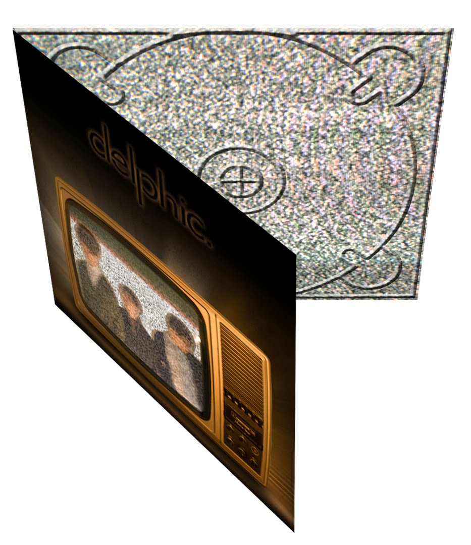
The digipak was produced primarily using Adobe Photoshop, For our photoshoot we used the three male members of our group, Me, Jack and Sam. The aim was to achieve a blurred effect, to create this blurred effect we reduced the shutter speed on the camera as well simply moving the camera slightly mid capture.


In Photoshop we took down the opacity of our band photo and then layered with the television static. Furthermore we added a gaussian blur efffect to achieve the bright glow. To complete the album artwork we placed in our logo and added a glow to match the television.

For the reverse of the digipak we used another photo from the band shoot which featured all three of us in ascending height order, we placed this into a photoshop document and simply overlayed the track listing in text boxes. We also zoomed in on two of the jaws of people in the original photo, unfortunately it was felt that the colour of the original photo didn't correspond well with the television on the front. Therefore to maintain a consistent colour scheme we altered the colouring to give it a slight orange tint. The same thing was applied to the inside panel.

For the inside panel we created the same effect as the band in the static on the album artowork. So we layered two photos and altered the opacity of both pictures to create the overlay you can see. Opposite this is the CD tray panel for this we just cropped some of the television static from our original photo to retain the image throughout. Then apply a bevel and emboss on a CD template, to create the tray effect.


To finish the product we wanted to create it in a 3D sense, to give it that effect of an existing digipak. This was done using a 3D template; we then changed the perspective of each panel to place them correctly.

Evaluation- Question 3

What have you learned from your audience feedback? Once we had completed our second rough cut of the video we organised a small screening in the media room, inviting along various people inn the sixth form who had previously not seen or did not know the contents of the video, in order to get a non-biased reaction. We chose these people based on the fact that they all fitted in with our target audience age band and also they seem to be the style of people that will like the music and the themes of our music video, fittting into the description we set out in my post "Target Audience Research" Here are some photos from the screening:
After the screening we chose a selection of people give us feedback in an interview situation. We did this in groups of two and asked the following questions:
* What were your initial thoughts? * Were you shocked by the ending? * Do you think the visuals correspond with the chosen song? * What do you think are the positive aspects? * What do you think are the negative aspects? * If anything, what would you change about the video? Here are the results:

Audience Feedback - Rough Cut 2 from WGSB on Vimeo.


The audience recieved the video really well and the feedback we gained was very positive and constructive, with every interviewee praising the video in some way. However this may have been down to politeness. But it wasn't all niceties there was some constructive criticism.

Elements people particularly enjoyed were the party scenes with strobe lighting and fast paced editing, as well as the setting and casting. Furthermore the subtle hints throughout to the shocking finale. On the other hand some people felt that the animal masks and the inclusion of the younger boy was confusing, and seemed 'too random' at times, however as this key idea of our video is placed to confuse and alter the narrative, I believe it worked effectively.

We used the feedback to tweak our video, including some faster cuts, in an effort to break up the monotonous scenes such as Jack getting dressed and going to the bathroom. We decided to alter this based on Mrs Mcluckie's views as well our audience and our own opinions. The main conclusion we drew from this research was that the video was a product that appealed to the target audience, and that could be used in the real world as all the viewers were pleased with our efforts. Perhaps it was a narrative some could relate to, or perhaps it acted as escapism. We tried to encapsulate a skins-esque teenage drama within the space of 3 minutes, and we hope this has been achieved.

On completion of the final cut I put a link to the video on facebook, to get further feedback from the target audience.


One of the commentators, who happens to be studying Media Production at University, with experience at the BBC, had this to say

'I liked it. Editing to the beat can be tricky when trying to hold up a narrative. But you pulled it off by using constant "flash back" clips. Also, the picture in picture effect contained just the right amount of shots. Overloading the viewer with information can draw attention away from the narrative flow.

The reference to the child, suggesting a forgotten innocence within the character, tied in well with the video's portrayal of todays youth.

Overall, the sequence included some well thought out editorial decisions and I was happy to see normal cuts, rather than quick fix transitions.

I give the Prodigy parody a 80%, I deducted 20% due to indieness.'

It was great to receive feedback to receive feedback from an experienced perspective outside of school, although the last sentence was a joke he has clearly picked up on the purposefully placed references t The Prodigy's video 'Smack My Bitch Up' which acted as a great influence in the narrative and filming of our video. In addition he compliments the fast paced editing, and inclusion of the young boy as a juxtaposition with his elder self, which some others found difficult to understand, this helped confirm our belief in the video and its themes.

Another positive bit of feedback was the final comment left on my facebook post, which stated "its amazing, I can really imagine it being the real video to doubt" this really pleased us as it reassures that the product is a credible media text of its genre.


All of this really positive feedback is great but it is always good to get negative feedback from an Audience and Mrs Mcluckie was always at hand to aid us, she often found our original work to be slow monotous and boring, if you look at our rough cut, she disliked our early footage due its static nature as well as the bad choice of lighting and cast. However I think you will find that in the later cuts our party scenes became tighter, with more controlled movement. On top of this we changed our narrative to the morning after/later that night effect that was changed due to Miss's comments about our early rough cut, into a more focused, exciting narrative, with much more interesting mise-en-scene and camera movement.

Evaluation- Question 2

How effective is the combination of your main product and ancillary texts?

Evaluation 2 from Jack Osman on Vimeo.


Here is a copy of our script for the voice over

Jack: We have produced a series of products, including a music video, website and digipak to promote the release of an album by the band Delphic.

There are several themes and images explored throughout each of our tasks that maintain a consistent house style.

Sam: The main video is a narrative based affair that follows a morning after, the night before scenario where the lead protagonist; Jack has regretted or doubted sleeping with someone. This of course resonates with the title of the song; ‘Doubt’.

Louisa: Both the digipak and video explore the theme of confusion, and hiding your true identity. This is represented via the use of animal masks. In the video this theme is explored more explicitly with Jack masking his homosexual feelings; in attempt trying to convince himself he is heterosexual before coming to terms with the truth.

Jordan: In the digipak the masks are used on the inside sleeve opposite the disc tray, this is to hide the identity of the band itself. This is something we have consciously decided to do, in order that there is more emphasis on the band’s music rather than image. Additionally it creates an air of mystery surrounding the band, which may intrigue potential audiences.

Jack: The fact that Jack masks his homosexuality is referenced throughout our video in a variety of manners. Most notably in the scene where he looks up into a mirror to be haunted by the image of himself wearing a bear’s mask. The split personality in the mirror represents the trouble he is having choosing his sexual orientation.

Sam: The video culminates with Jack battling through several party goers adorned in the aforementioned masks, as the feelings of paranoia and regret take over Jack tries to escape the clutches of scene of the incident by running towards the front door. Upon opening the front door he comes face to face with his ‘one night stand’ and finally accepts his homosexuality.

Louisa: The theme of bright, neon lights is continued throughout all three promotional products. In the video this obviously applies to the shots of the strobed party.

Jordan: On the digipak the television dominates the album artwork with a bright glow, to illuminate the image and the presence of the band. Furthermore the links tab and the updates section on the website are coloured in bright green and blue thin strips representing neon lights. This theme ties in well with the electronic genre of the music.


Evaluation- Question 1

In what ways does your media product use, develop or challenge forms and conventions of real media products?


Shot 1- Intro Shot- To create a party scene we used a strobe light to create the party atmosphere. Strobe lighting is quite typical of the music genre we are focusing on, and also of the theme of our party. The shot is quite a simple establishing wide shot, typical for an opening of a film/video. The clothing of our actors was based up on the modern fashions of today to fit in with the genre of music, which is at the forefront of fashion. This party was meant to be a modern, lively, youthful party to fit in with this style. Our introduction is a good example of cutting to the beat, the cuts were fast and fit into the "ah eh ah eh oh" beats of the music.


Shot 2- Bedroom Scene- For the camera work we used a variety of wide shots, close ups, and POV shots, to create a wide view of the bedroom and it gives the viewer a broad idea of what the protagonist is seeing.

Shot 3- Close Up- This close up shot of the protagonist singing the lyrics is a typical shot to find in a music video. We had really strong lighting as to create strong shadows, creating a strong tonal range over his face, which emphasise his features, further emphasising his mouthing of the words. These shots are a particular favourite of mine as the really pull the viewer into the lyrics, highlighting the theme of Doubt in the music video. This screen grab to the right shows how this close up of the vocalist/protagonist singing in the video is used in other videos. This is taken from the video for The Maccabees "Empty Vessels", which is a video we used for inspiration so therefore I felt it fitting to use, as you can see the lighting in this grab is quite similar to ours, the dark tones to the right of his face highlight the anguish on the young childs face.


Shot 4
- Flashback- This flashback is taken from Point Of View of our antagonist, you can see there hand opening the draw, there is a hint of desaturation in the shot, to distinguish from the rest of our shots, this is set through all of our flashbacks so that the viewer can see the difference between the time periods. The majority of our flashback work is done from POV, considering the story follows a sexual encounter the majority of the camera work is done handheld, to create the
effect of nerves, excitement and enjoyment. This idea of POV was taken from the "Smack My Bitch Up" Video for the band, The Prodigy, that whole video was shot in Point of View and the movement of the camera fits to the pace of the music.


Shot 5- Bathroom Scene- This scene is used to highlight the anguish of the protagonist, the anguish and regret of our narrative follows the conventions of mirroring the lyrics. "Wanting meaning, wanting more than the same things" As you can see from this screen shot of Will Smith in his 2004 film i,Robot, the anguish of his past is shown through this shower scene, you can see the similarities in this shot to our shower scene.


Shot 6- Smoking- We decided to show him smoking as this is another form of showing regret, smoking is a form of stress relief, we chose to do it as a close up because close ups are used to make it all the more impactive, smoking is a very difficult, hand-fuelled task therefore I felt it right to shoot from close up, we also chose to use roll-ups because it is a staple of cool, as you see in notable indie films such as Quentin Tarantino's "Pulp Fiction", As shown in these grabs from the film.


Shot 7- Kiss Scene- This is our final shot of our music video, it is possibly the most controversial shot of the whole video due its homosexual content. However it is exactly what we desired it to be, it is not only impactive but immediate. It lasts for a very short time before it fades out, not giving the viewer enough time to feel uncomfortable but enough for it to make an impact. We used bright lighting techniques here to emphasise the action that is unravelling. Our Mise-en-scene for this scene was pretty limited and the camera movement was little, my aim as cameraman was to gain a tight close up of the kiss, to emphasise the controversial empassioned kiss.


Digipak
-Front Cover- We took the convetnion of band photos on a digipak and manipulated it to suit our idea. We took a photo of a tv, with white noise playing, and superimposed the image of the band, it creates a sense of confusion, and the unknown. While creating a futuristic sense with the glowing TV image. If you look across a vast majority of album front covers, the themes are not certain and random imagery is often prevalent, as you can see in this digipak front cover for Yeah Yeah Yeah's 'It's Blitz'. The rest of the digipak followed the theme of TV and white noise, while interspersing ideas of animal masks from our music video, intertextuality is a convention we felt we had to stick to, as well has having a theme or motif through the digipak. We showed the theme through our digipak by using similar colours and images throughout. We also used the same fixed text for the band name and the tracklisting, which is placed on the back. These are all basic conventions of digipaks.


Website
- Our website is quite simple and is made of promotional information and images, which is the main focus for a website, to advertise and promote. Our clever animations which can be seen if you follow this link. The title 'delphic' zooming in with the bar expanding and retracting, these animations are really effective in involving the user, this interactivity is always important to engage the fans of the band, also the username and password area creates and exclusivity to the users. The updates section is key to give the viewer some recent information for the band. As well as this the music video we created is placed on the website, this intertwines our three products, with an advert for the album and the video, this follows on from the convention of advertising and promoting the band.

Monday 22 March 2010

Rough Cut 2

Doubt Rough Cut 2: from Jack Osman on Vimeo.


After our change of idea, here is our second rough cut. As you can there is a lot of changes to our video, not only have we finished the filming for the whole video, we havbe changed the verses to make a more narrative based video, which are interspersed with cut aways of the night before, flashbacks if you will. The next stage is to fine tune this video into our final cut, we want to change a few shots as well as edit the flashbacks to differentiate them from the main narrative. Our second rough cut was well received by Mrs. McCluckie. The change from Jack miming in the verses to more narrative based scenes was seen as a vast improvement. This rough cut however is by no means perfect, and we know that. Scenes Miss did pick up on include;

* The shots of the two of us holding hands reveals that it is a homosexual love affair too early on, due to the hair on my arm. Therefore that needs to be re-filmed.
* The scenes whereby Jack gets up to go to the bathroom and where he is getting dressed are too long and monotonous. We planned to rectify this by breaking these shots up with a variety of cuts, featuring the party or flashbacks.

In addition there are a few shots we don't personal like, and some of the editing needs tweaking, but apart from that it seems we are finally near the end of the process.

Website- Key Elements

The website is made up of a few different elements that go further than just using the pre-set add ons in Dreamweaver.


The most noticeable one is the use of animation that was made in Adobe Flash. The title, menu system and banner were all made giving the website a more exciting feel, the animations give the website a less static feel. Interactive features like this keep the user more involved in the website and are less likely to move from it. A music artist's website must do this to keep the user on it long enough to convince them to buy their music or watch videos. Another element, that can be seen above, was an input area for users. This is for a username and password, which is where users would log in/sign up to the band's website gaining them access further information, a less dedicated user could not reach otherwise, this is a common feature of band websites.

As well as this we have an update list shown above and the image below shows the album advert animation that was included on the website.